As I am creating my own website, I will study two websites and compare and contrast these. This website research will help me in understanding how to create my own website so I will consider the overall design, colors, and typography, navigation, usability/user-friendliness, links and mobile view.
I will be looking at Yulia Ruditskaya and Fx Goby as these two are the animators and
I will begin with Yulia Ruditskaya's website. Below is the Home Page of the website.
In the website, I found the homepage was the animation menu. There were more than 25 videos in the homepage. The videos were organized with 3 rows and 10 columns. While navigating to the videos, it showed the titles of each videos and after clicking the video, a new sub page opens where there are the information about the video. I like the Menu options, they were organized properly. Each artworks had the separate menu which I am thinking to utilise in my own website.
The image above is the mobile view of Yulia's homepage.
We can see that Yulia has worked hard during her life as a director as well as an animator. She is very good at illustrations too. Navigating to the other menu pages are smooth. I liked the white background of the website as the main theme. She has been able to provide a sense to the viewers about her personal works, illustration, reel and music videos.

After checking her personal works and her illustrations, I clicked the About menu. The image above is the layout of the About page. As seen on her website, I found out that she has won many awards and achieved so many special goals which are still a dream for me. I was really inspired by her achievements. There were separate links for the award page as well as the videos too. The font of the typography is ariel.
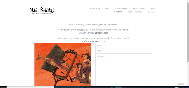
Image above is the contact page of Yulia's website. After researching her artworks and knowing about her, I clicked on contact page. The contact page has a very beautiful illustration about mermaids. I liked the view of the page. The contact page has two of Yulia's email. One was for invitations to workshops, instructional opportunities and festival screenings and second was the email where we can mail her for the business purposes. There was also a form to fill and send the author with name, email and a message.
I also checked her page in the mobile view. It seemed that the website was more beautiful and attractive in the mobile view.
At the end, I checked the copyrights policy on her every menu. The copyright included her name and I also noticed that her website has two Menu options, one was in the header and another was in the footer.
After Researching about the website of Yulia Ruditskaya, I considered the website of Fx Goby. Please see the homepage of Fx's website.
The website started with a video intro in the background. Where it was written Film Director in a bold font and with spacing of the words. He seemed to be very popular artist but his website was not quite impressive. The website was lagging and I also encountered the click delay. I can say that it was hard to navigate between different pages.
The above image is the animation page of his website. There were several animation videos which were popular. The video only had titles but were lagging. However scrolling the page was smooth.
The image above is the About page of the website. The page had the biography about the artist. The typography had some Highlighted words to catch the viewers and make them know about his great achievements. I liked the About Page more than other pages, because of the amazing awards which he had been awarded with. Please see some information about his awards below.
I liked the design and preset of the awards. The blue color of the preset really attract the viewers. I thought he did not have any contact page at the beginning but the contact was shifted to about page. After scrolling down, we can find the contact details. Please see the contact details below. It has an email and a link to the studio page where he works.
Scrolling below more in the about page, I found the client details. We can see so many top companies who were his clients. Please see the details of the clients below. He has worked with companies such as Google, Disnep, Cocacola, etc.
At the end I checked the website on mobile view which failed my expectations because it did not have a mobile version. We had to zoom in and zoom out to navigate to other menus.
Comparing both websites, I found out that the website of Yulia Ruditskaya was better than Fx Goby. Yulia's website was smooth and easy to navigate different pages because it had two menus, one in the header and another in the footer. Yulia's website has more contrast and vibrant than that of Fx's website. Everything was organized in Yulia's website whereas Fx's website has unorganized and click delay pages. However, the achievement of Fx was more valuable than the Yulia's. Overall, while looking at these two websites, I realised that I need to add some menus and make my website look more organized. I will also add a new menu for quick access to different pages. I will make sure to make the website look beautiful and attractive to the viewers and make it worth their time to visit it.


Comments
Post a Comment